Is this link going to open a new tab?
This happens to me very rarely, maybe few times a month, but when it does, I find it super annoying. What is it?
Sometimes when I click on a link, I expect the site to open a new tab for me, and it won’t. Or the other way round: I don’t want this link to open in a new tab but it actually does.

Some people don’t care, but I do. UX is about suggesting to the user, not removing control from him.
From a developer point of view, a correct usage of target="_blank" has been a widely discussed topic for quite some time and I think it is now time to cut-it-short once and for good.
State of the art
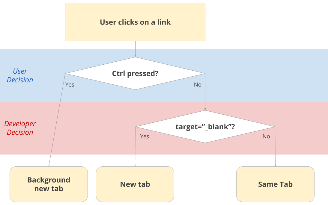
First, let’s recall how most browsers currently work:

I call it simplified because there are others actions in Chrome and Firefox, but certainly much less popular. For instance, I did not even know that Shift + Click opens a new window instead of a tab before writing this article.
Looking at this diagram, several restrictions appear:
- if the developer wants to open a new tab, the user cannot stay on the current one
- the user decision needs to be made blindly, without knowing if a new tab will open itself
the user decision is whether to send the new tab to the background or not, which is useful in a browse-it-later scenario, but it is not possible to keep the current tab open AND follow the link without developper’starget="_blank"
Edit: I just found out about the
Ctrl/Cmd+Shift+Clickbehavior, which opens a tab and jumps to it. The rest of the article has been modified accordingly
In the end, the user doesn’t have much choice, which doesn’t feel normal for something that happens client-side where the user is supposed to have full-control.
Proposal
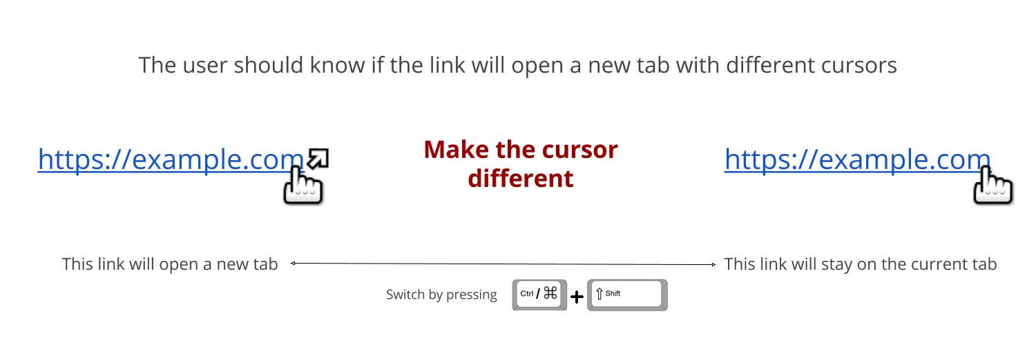
From there, I would like to suggest the following native modifications:
- Having a different cursor when link opens a new tab (
target="_blank"attribute):
- In addition to
Ctrl+Click, let theCtrl+Shiftkeys act as atarget="_blank"-toggler, meaning on hover the cursor would change to understand what’s going on.
With those two simple changes, each of the above restrictions is gone. The user takes aware browsing decisions, while the developer still can define a suggested behavior.
In addition, besides the new cursor, the feature is 100% backward compatible so nothing fancy to learn for the user.
In practice
This is actually very simple to implement on a per-site basis, so I did it here. You can try it now:
Here’s an internal link while this one is an external one.
Try pressing
Ctrl/Cmd+Shiftwhile hovering the links.

But because this website is not enough, I built an extension to have the behavior activated on all websites by default:
Download Chrome Extension / Download Firefox Plugin
You can find the source there. Along with the target="_blank" toggler written in JS, this is all based on this short CSS3 code:
a {
  cursor: url('/en/images/cursor.png') 4 7, auto;
  &[target="_blank"] {
    cursor: url('/en/images/cursor-ext.png') 4 7, auto;
  }
}
Quite elementary, right?
Mobile Notice
It is true that this proposal is not effective for touch devices. But being aware of the target="_blank" presence is one thing, being able to avoid it is another, and requires an alternate touch event (like the Ctrl + click on the desktop), which besides long-touch to display menu doesn’t exist yet as far as I know.
Eventually touch-ux-designers will come up with interesting proposals but as for now, tab management is a much bigger issue on my desktop than on any of my touch-devices, where I basically avoid opening new tabs as much as possible.
This is only my opinion though.
Extra Proposal
On each website I build, I add the following script on load:
Array.from(document.getElementByTagName('a')).forEach($link => {
  if ($link.hostname !== window.location.hostname) {
    $link.setAttribute('target', '_blank');
  }
});
Basically, it adds target="_blank" to every link that doesn’t target the current website.
While here, I would also like to suggest this to be default in the browser. How so?
Well, in the age of websites-as-apps, the user expects after clicking on an internal link to keep the same interface, that the browsing experience will be continuous. On the other hand, when going to a new site, this is a fresh start, eventually the state of the previous page shouldn’t be lost.
Along with the Ctrl/Cmd + Shift + Click proposal, this would be much less painful, because the user would be used to choosing between staying or leaving. Staying would be more equivalent of opening a new tab + closing the former.
Feedback
What do you think?
Let me know, I’d be delighted to discuss this and will keep updated the article with more insights.
Read Further
How to display comments on a web page
Comments replies are too often not correctly hierarchised
Continue →10 tips on how to improve design skills as a web developer
Developers often have a thing against design
Continue →


