10 tips on how to improve design skills as a web developer
Programmers usually don’t like design. Either they find it useless - making something beautiful doesn’t make it more useful - or they simply reject it, because they never managed to use it properly, or they simply find it boring as a discipline.
As a fullstack web developer, I have spent quite some time trying to improve my design skills, as it was quite a bottleneck for me to make websites autonomously. Here’s what I’ve taken from that now, couple of years later.
1. Use models, templates and frameworks
The first and foremost idea is not to reinvent the wheel. If you want to teach someone programming, you’ll suggest him to learn on Rails or any of your favorite frameworks because they offer high degrees of abstraction, allowing the newcomer to focus on what’s easy and accessible at his level, ignoring most of the complexity lying behind.
Well, same goes for design. Instead of facing immediately the white page syndrome, a beginner should start with an example, a model, a template depending on what applies, and make only very general customizations, like changing colors and images. Even playing with fonts will be too hard at this stage.
To find this example, look at websites you like, and select one which has data that structures more or less the same way as yours. Here are some common patterns:
- Blog: Wordpress templates
- Marketplace: AirBnB, and yes, there are templates
- Portfolio
- Events page presentation
- Mobile Apps
Once your model is selected, you’ll also need to use a framework, to avoid making gross errors. The most-by-far-popular one is Bootstrap which you probably already know, but it is worth taking a look at alternatives like Foundation, Material-UI, Materialize, or the brand-new Titon.
With those tools, you can be sure to not make something as ugly as most webpages few years ago. You’ll have basic graphical elements to compose with. But there is still some way to go to reach a decent level of quality. And most of it is invisible to an unexperienced eye.
In the next sections, I’m listing the criteria I have isolated myself and care of now. I have tried to sort them by increasing complexity, though this is highly personal.
2. Consistency over your website
If you want your website/app to give a positive general impression, you will need to be consistent all along your website. Using a framework like Bootstrap helps, but making sure you are using the same values everywhere is the key.
In order to achieve that, you should definitely use SCSS or SASS, and start by creating a file that will contain variables for the whole website. It could look like:
$font-size: 16px;
$font-family: 'Open Sans', sans-serif;
$font-weight: 300;
$primary-color: #XXXXXX;
$secondary-color: #YYYYYY;
$white: #F2F2F2;
$background-color: #F1F1F1;
$border-radius: 3px;

$wide-screen-min-width: 1040px;
$medium-screen-min-width: 740px;
$small-screen-min-width: 350px;
// And be used everywhere
body {
font-size: $font-size;
background-color: $background-color;
}3. Alignments: this is not for engineers only
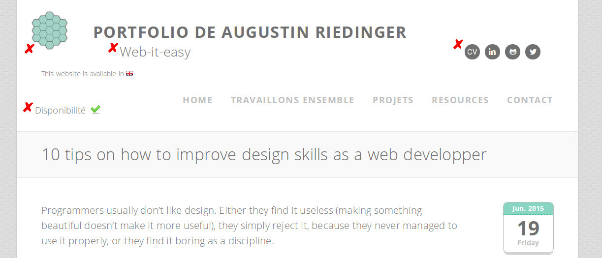
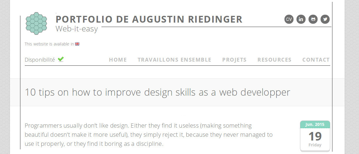
You may not believe it at first, but it does matter that your logo ain’t left-aligned with the rest of the content of your page. Whenever you can align things together, DO IT. You won’t seem like a too-rigorous-uncreative-engineer doing this, it will always bring some clarity and cleaness instead.
4. Padding: let it breathe
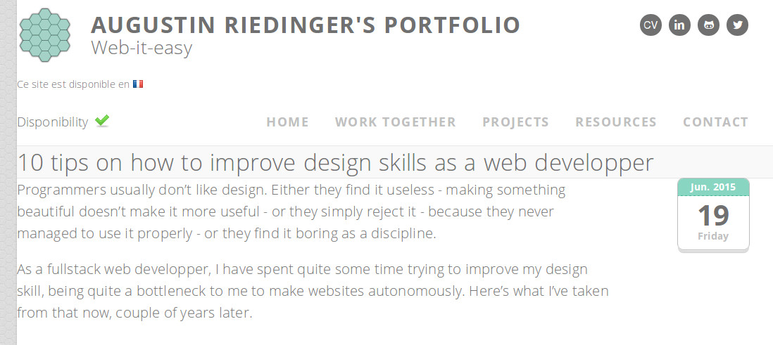
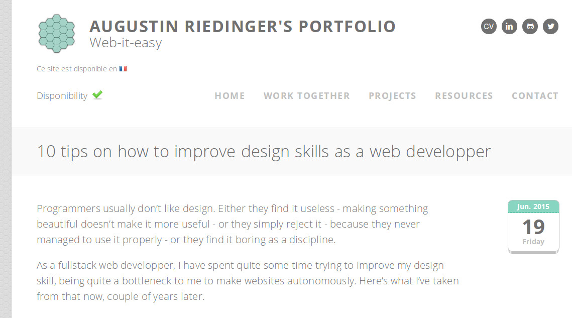
One major error from beginners is to forget to use padding. Except from titles (<h1>, <h2> etc.), very few html elements come with some default padding. As a consequence, if you don’t take a specific look at it, your pages will be too dense, and look bad. Simply having a text stuck with a div border should be a unacceptable anytime any situation.
5. Shadows: the light source is part of the page
Text and box shadows are here to give depth to your content. Keep in mind that box-shadows need to be coherent within a page (if not a website): if the light comes from the top-right corner, make sure all your shadow go into the same direction. Also make sure that if A is over B, and B over C, C never gets over A at some point, it would be incoherent.
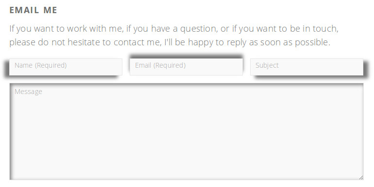
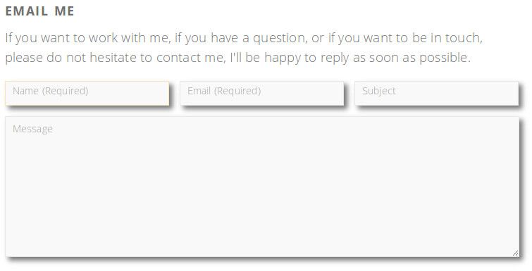
Text shadows are also very useful to highlight content on a multicolor background (a picture). In the two screenshots below, the title without shadow is less readable than the other one.


6. Typography: don’t use the Coca-Cola font
You are very suggested to learn the basics of typography. As some mention, Web Design is 95% typography. This can be a pretty long topic, so I’ll stick on very basic rules:
- A serif font goes along with a sans-serif font partner. There are very popular webfonts and their pair, so again, USE IT!
- The width of a line of text should not be too short (tiring) neither too long (hard to find next line)
- Line height really matters for readability also
- If you have no clue from where to start, use Open Sans, you won’t make a mistake
7. Colors
Your website should be based on two colors plus a custom white. It is enough to get started. The first color which characterizes your visual identity the most will be called primary color and the other secondary color. They must fit well together.
There are tools to help you with this, though I’ve usually found easier to use a color palette and pick them according to your tastes.
If at some point, you really need more colors, start adding nuances to those two first. to remain coherent. If you use SCSS or SASS (which you already should since tip #2), try playing with the lighten and darken functions and check your results.
8. Buttons
Your primary actions (the one you want to take your users to the most) will be using your primary color, and your secondary actions using the secondary color.
Your buttons need react to certain states. The very minimum being the :hover state. If you lack of inspiration on what should happen when the mouse is hovering the button, try a simple opacity change. It works almost everywhere.
Also,
Here’s how the whole buttons definition would typically look like, using Bootstrap’s class names:
.btn {
  border-radius: $border-radius;
  border: $border-width solid;
  color: $white;
  padding: 3px 5px;
  &:hover, &.active {
    opacity: 0.8;
  }
  &.btn-primary {
    background: $primary-color;
  }
  &.btn-secondary {
    background: $secondary-color;
  }
}
9. Use your eyes
It is important to always take a step back and look at what you are doing. In many situations there are optic aberrations which makes a centered text look un-centered, a color look different than another depending on the background etc. You really should play with this. Prefer having a button with padding: 3px 5px 5px 7px; instead of padding: 5px; simply because it is theoretically symetrical.
10. Get familiar with the tools
Finally, it has been important to me to get comfortable with the designer tools. You should have Photoshop or Gimp (open source and cross-platform) installed and know how to use it. A good way to test yourself is to ask:
Can I produce in Photoshop/Gimp the same visual result as I can in CSS?
As long as the answer is not yes, keep practicing. As far as I am concerned, I forced myself to use only Gimp as an image editor, even when it really did not make sense as a Paint-like would have easily done the job.
After some time, the answer to the former question turned into a yes, despite I still find it much more convenient to write CSS code than to make layer and mouse operations. No kidding, I remain a developer after all!
Going further
Like any vast topic, it is worth learning it. Start by reading things and others: it is a slow maturation process.
I won’t make a huge list of suggested readings here, as I think you should let the information come to you instead of going to it. My single exception will be this very good article: A guide for visual design for everyone.
After that, go get some newsletters, and focus on what sounds interesting to you when you see it. You can subscribe to:
- Hacker Newsletter design Section
- 52 Weeks of UX
- Good UI
And to finish, the best school has always been practicing. So start working on your own designs. Apply to them all the above rules, and be perfectionnist because that’s the key to being a good designer … and yes, this will take some time, but don’t worry, at the end the result is worth the pain!
Read Further
How to display comments on a web page
Comments replies are too often not correctly hierarchised
Continue →Is this link going to open a new tab?
The user should know and choose if the link will open in a new tab
Continue →


